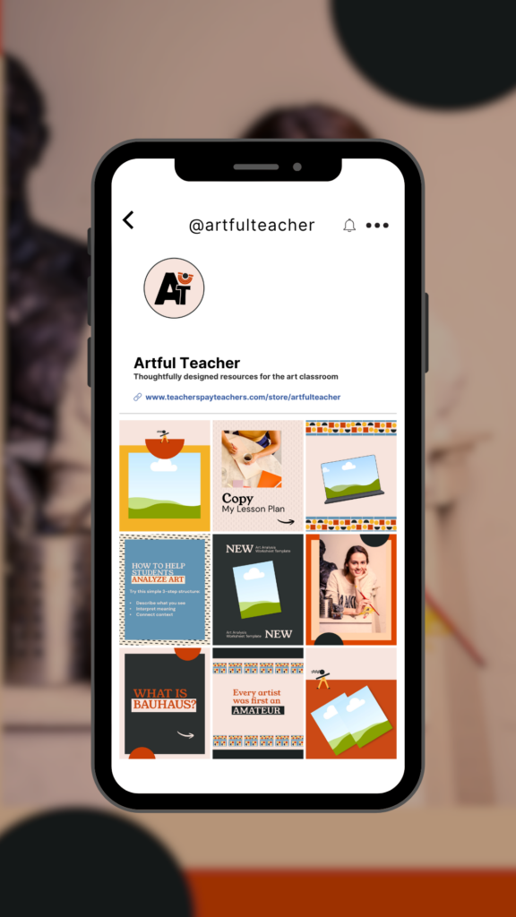
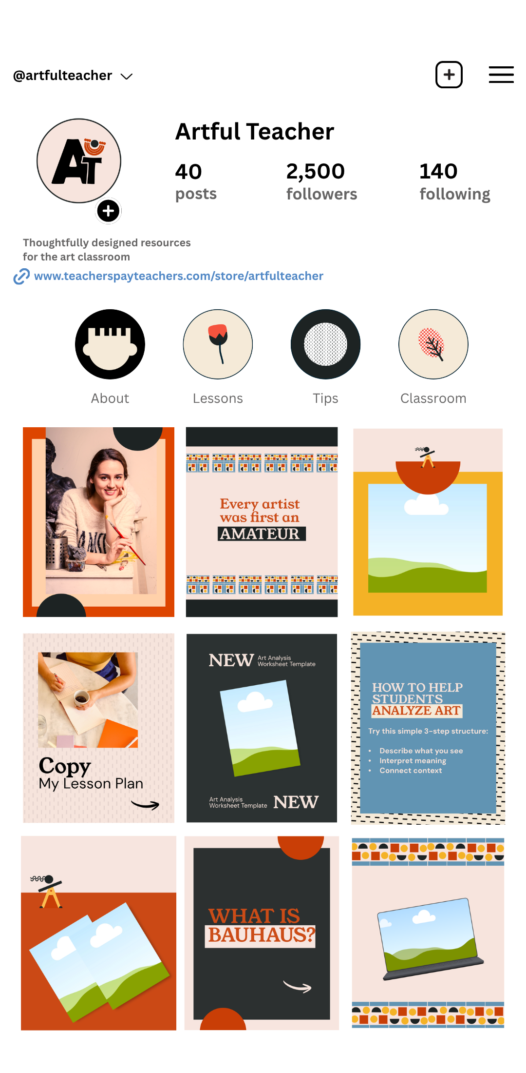
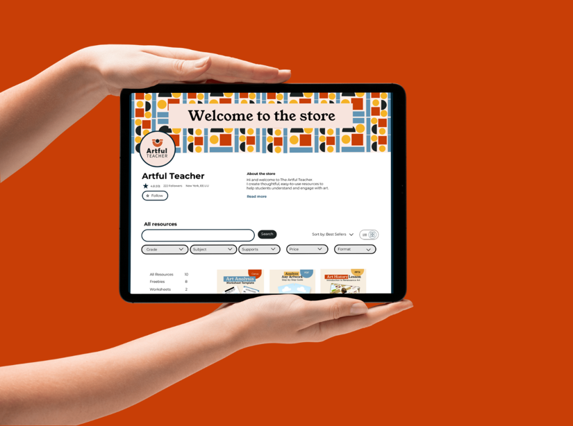
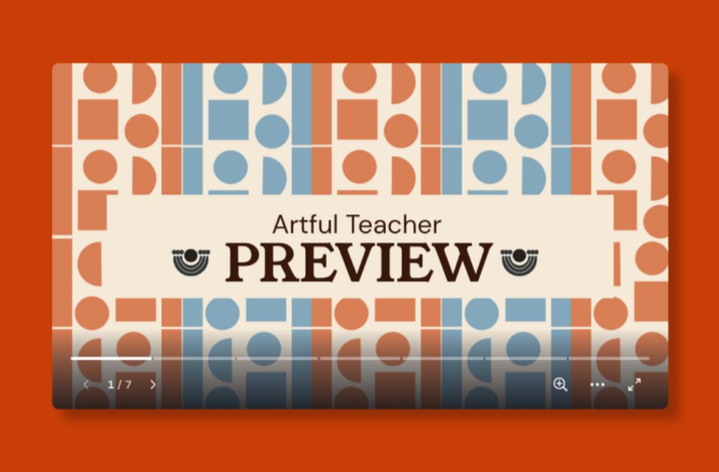
Brand identity -TPT store front design -Social Media Posts design- Resources design
Challenge
A high school art teacher needed to rebrand her TPT store. Her current visuals were not recognizable and did not reflect her personality or teaching style.
Solution
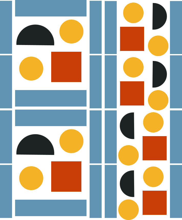
I created a brand identity inspired byBauhaus and mid-centurty design. The goal was to develop a visual style that feels playful, artistic, and cohesive across her TPT store, products, and social media.
Process
To define the visual direction, I first created a moodboard inspired by Bauhaus and mid-century design, focusing on shapes, colors, and patterns.
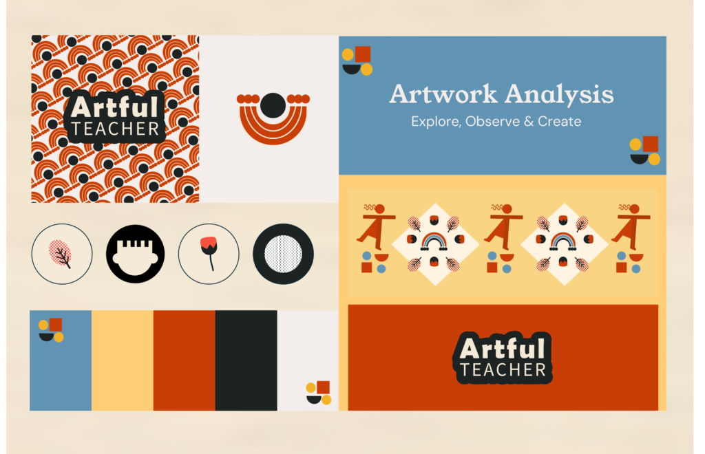
Using those ideas as a guide, I developed the color palette, typography system, logo, and supporting brand elements shown here.
Everything was designed to work together consistently across different platforms, from product design to social media.
Brand Elements
Logo
I drew inspiration from semicircle shapes and mid-century floral designs to create a playful and artistic logo, which I designed in both vertical and horizontal layouts, along with a mark that can be utilized across various applications.
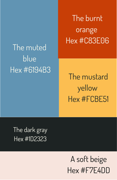
Color Palette
The palette captures the mid-century modern essence through a balanced mix of muted and warm tones.
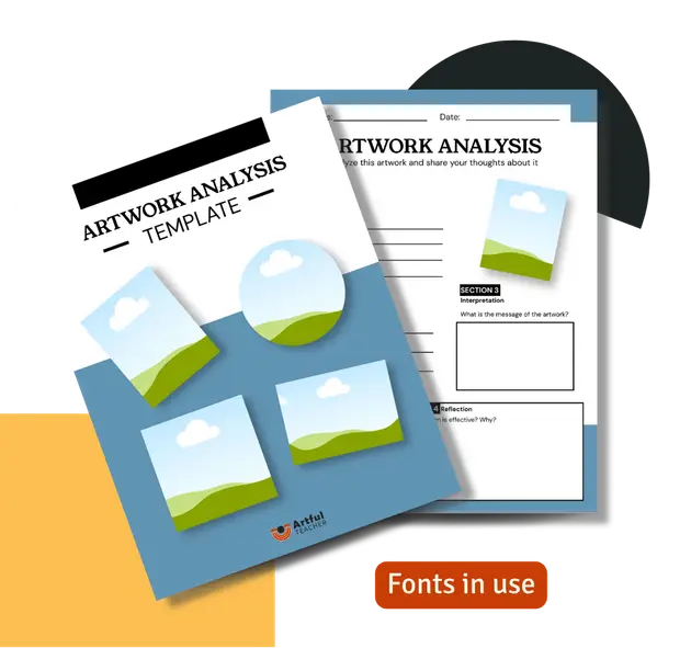
Fonts
Young Serif
Headings
DM Sans
Body Text
The heading font brings a subtle retro feel, while the body font is clean and highly readable. Together, they create a balancedvisual style.