Brand identity -TPT store front design -Social Media Posts design-Resources design-Landing Page Design
Challenge
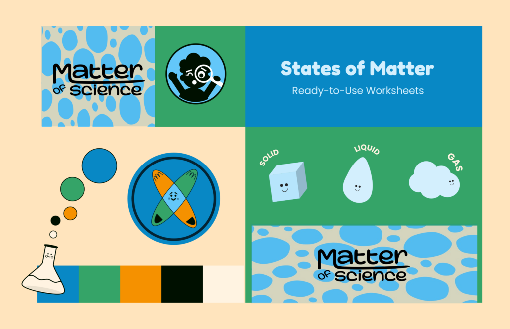
A primary science teacher wanted to make her lessons more engaging and accessible for young students, while also building a cohesive brand for her TPT store. Her current materials and brand lacked visual consistency and did not fully reflect her teaching style, simple and clear.
Solution
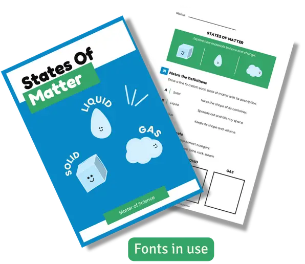
I created a cohesive visual identity and a set of ready-to-use resources designed to make science learning more engaging and easy to understand. The brand focuses on a clean, friendly style that works consistently across her TPT store, product design, and social media.
Process
To define the visual direction, I first developed a moodboard that captured a playful and engaging style aligned with the needs of young learners.
Using those ideas as a guide, I created the color palette, typography system, logo, and supporting brand elements shown here.
Everything was designed to work together consistently across different platforms, from product design to social media.
Brand Elements
Logo
The logo is designed to feel dynamic, playful, and simple, reflecting the engaging nature of the brand.
Color Palette
Fonts
Fredoka
Headings
Poppins
Body Text
The rounded heading font adds a friendly and playful feel, while the body font keeps the content clear and easy to read. Together, they create a balanced and approachable style.
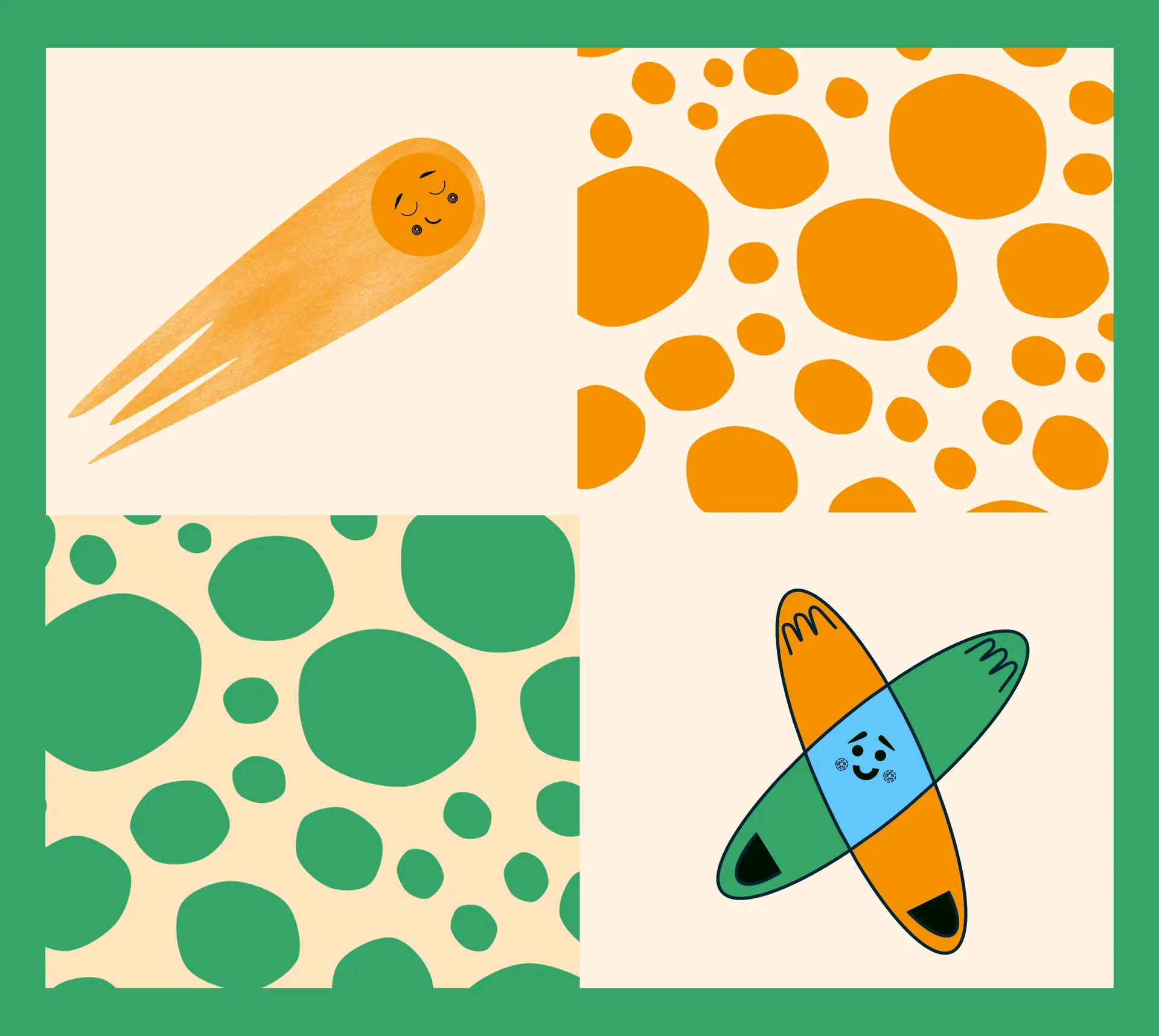
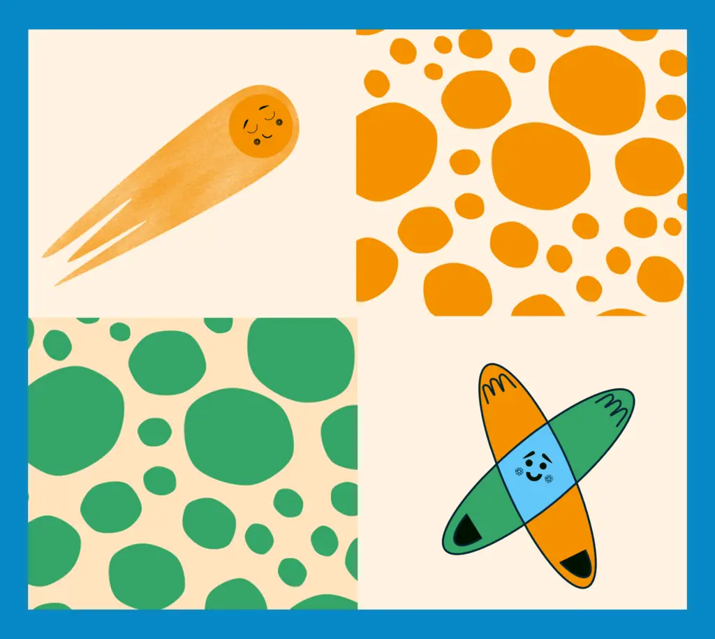
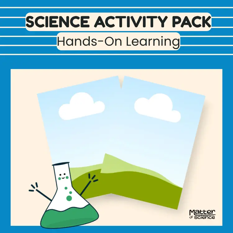
I created other elements that can be used independently or in a pattern across products and social media to keep everything visually consistent.
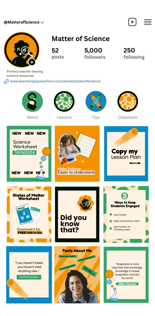
Social Media Brand Design
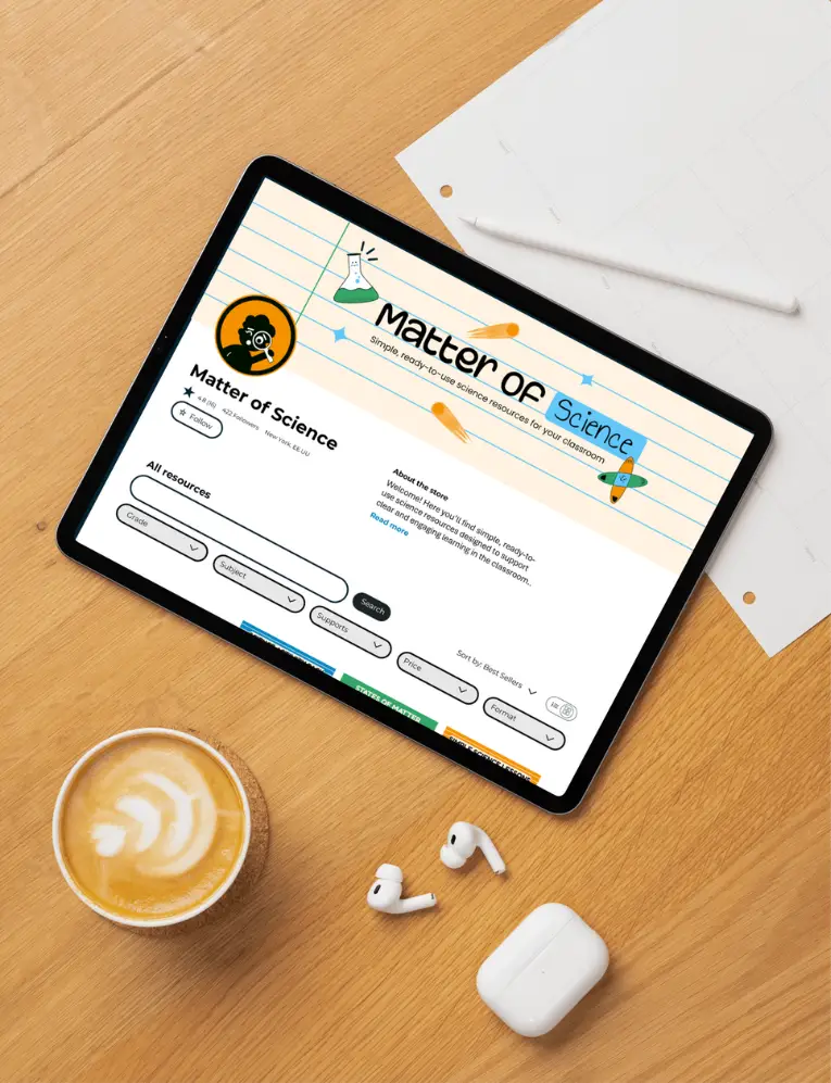
TPT Store Banner Design
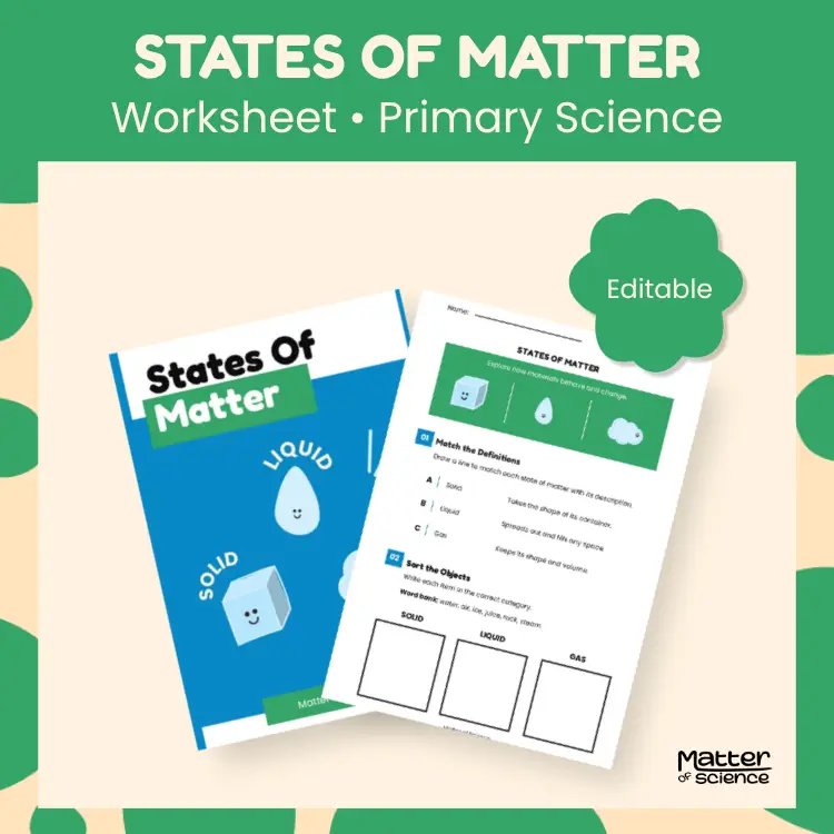
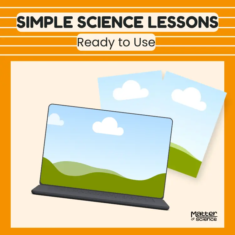
Fully editable Canva thumbnails templates
To support email list growth, I designed a landing page for a free resource (opt-in).
The layout focuses on clarity, a strong call to action, and a simple user flow.
This design can be easily set up using tools like Mailchimp or WordPress.